meta data for this page
Translations of this page:
- en
This is an old revision of the document!
Window: Create (simple) + Add a Widget
Window: Create (simple)
From experience, a window can be created and the user can not see it!
This happens if 2 options and 1 action are set:
- Option 1: The
Main menu>Launcher Options>UI & Animation>Blur behindis not activated. - Option 2: The window object
Background>Color>ARGB codeis set to transparent such as 00000000 - Action: The user has no objects placed in the window container.
Sounds too simple, but happens … and if it does, try to remember this tip!
Since the above TIP has been mentioned, the procedure includes the “simple” addition of adding an “App widget”. If that is not want, simply change what the window is to contain … leave the window empty but make sure to retain the default background so the window does not appear to “disappear”.
- On the home screen, enter Edit On mode (see here for details) or one method is to long-press an empty space.
- In the to Object Design Menu tap the
 icon
icon - Select Graphic
- Select either •Image or •Text
- Image if the screen object to open the window will be an icon-type
- Text if the screen object to open the window will be text-based
- Note: There is another way to open a window: gestures. A #FeatureRequest has been made to the Developer to extend the Launcher's
Action>Invisible when edit mode is offto a toggle which permits a toggle.
Imagewill be the example selected here
- From the dialog listing select
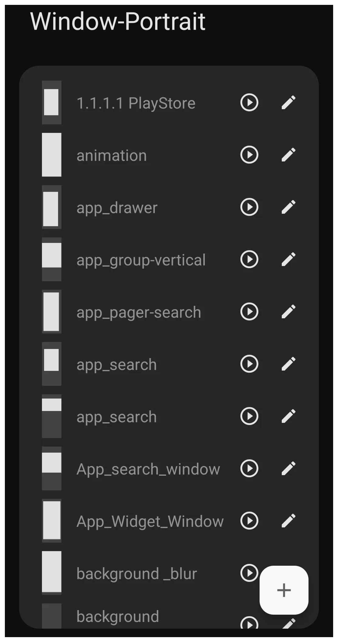
Window- The Window-Portrait dialog shows any previously created windows (see image).
- When a window design is created, it is specific to it's designed purpose and will retain it's previous characteristics or, if modified here, will change those characteristics where it is elsewhere being used.
- To add a unique window design, in the lower right corner tap
- In the Title dialog, enter a unique name for the new design. As an example:
App_Widget_Window- Note: no spaces or hyphens are permitted, only underscores (_)
- Tap OK
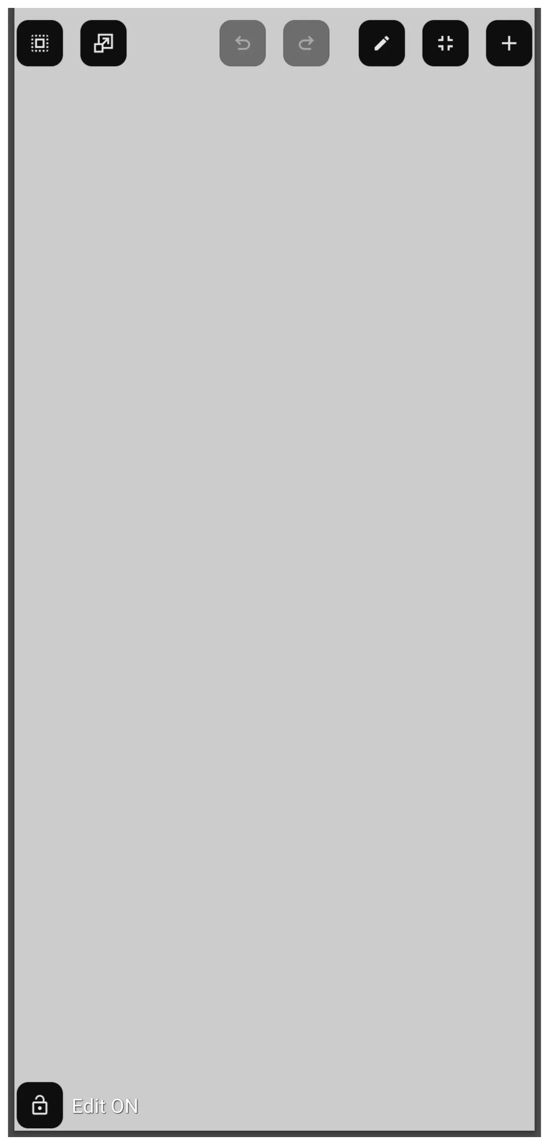
- Tap the Action icon
 to open the new window in full screen mode (see image). By default, the window background is light gray. The top Object Design Menu
  includes 2 key icons:
- Edit (pencil)
 - Tap this to enable:
- bulb handles on it's boundaries used to down-size the window
- Option icon
 in the lower right corner of the window opens the Window Option dialog and the Window Animation dialog. (see image).
 - While the Edit and Option dialogs will not be discussed here, more information is available at Window - Option and Window - Animation in the uiTotalLauncherManual wiki.
- Add icon
 - opens the Add Object dialog
- objects, such as an app widget, layout, or graphic can be added to a new window.
- In this example only the window is being created, so an object will not be added.
- Back out of the window by swiping right-to-left to return to the Window-Portrait dialog
- Back out of the dialog by swiping right-to-left again
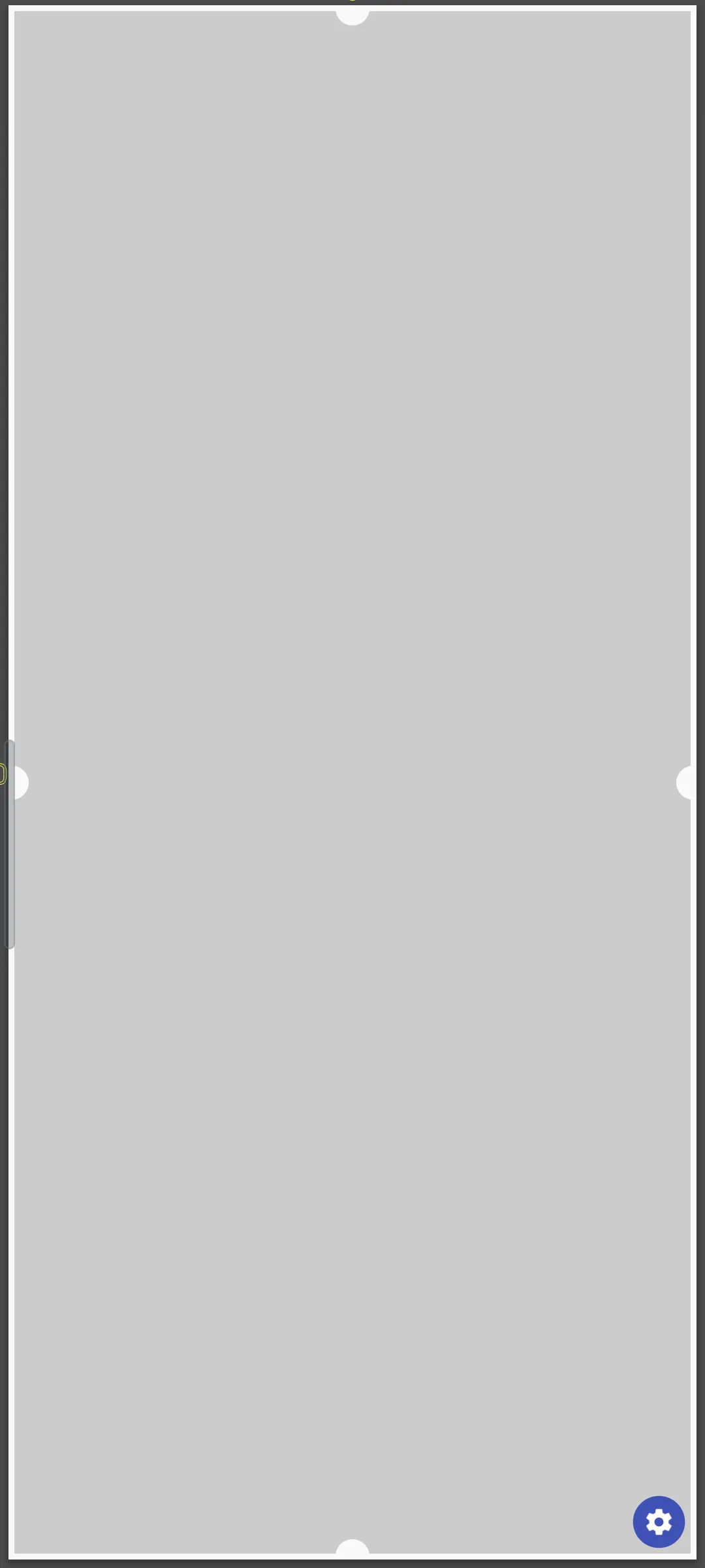
- The new “image” for the window object icon (not the window itself) appears in the center of the page selected (highlighted) (see image).
- The “bulbs” in the center of each container border can be used as a handle to tap-hold and drag to modify the area of the window object icon.
- Resize and position on the screen as desired
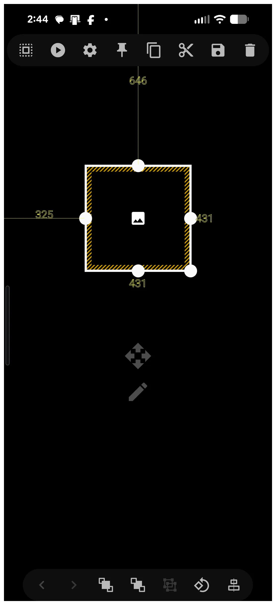
- This window object icon can also be re-sized and moved by opening it's Edit mode
 with a light tap to the selected object. This method of editing is reviewed in detail at Object Editing.
- The window object icon which activates the window is on the page with it's default image.
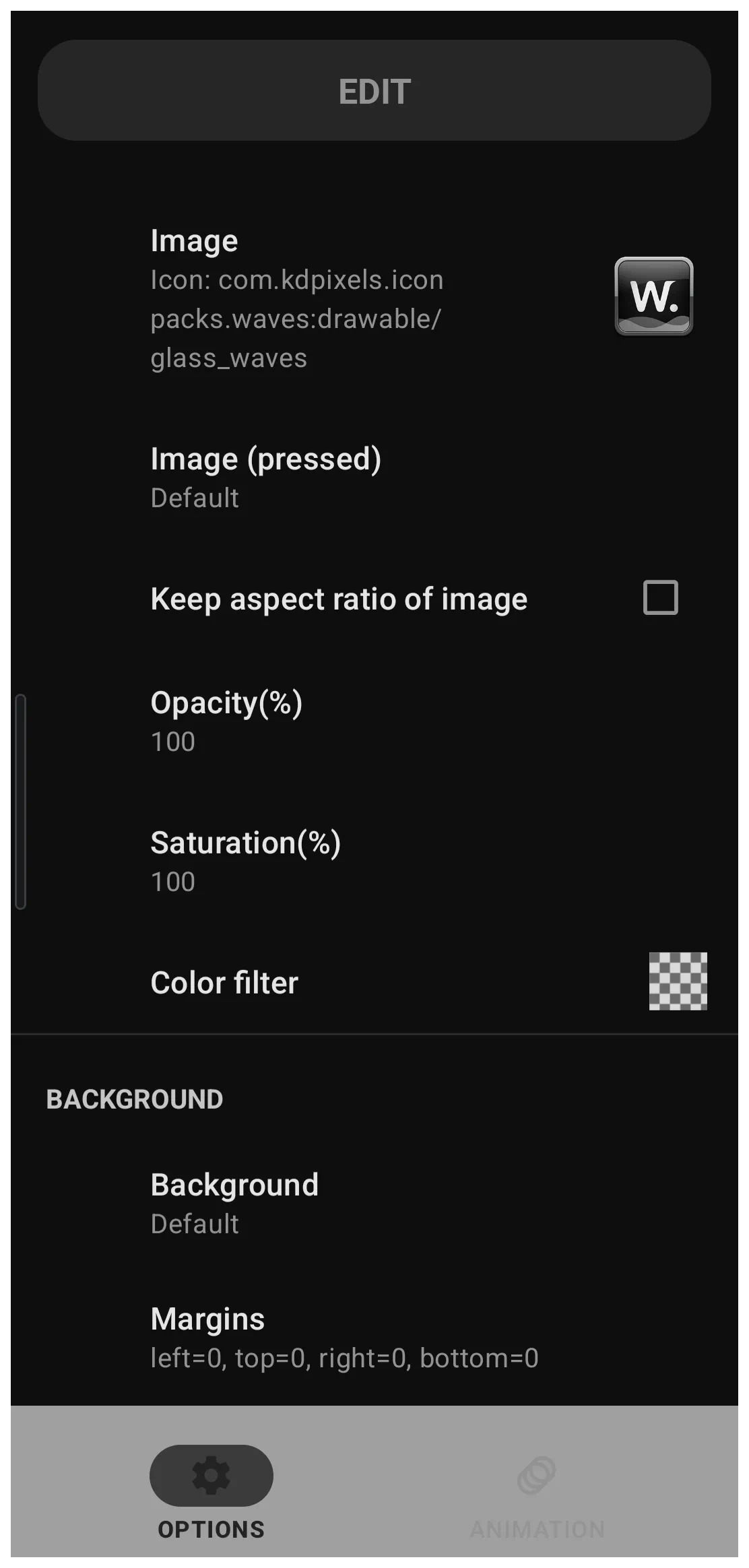
- This image can be changed by selecting the object (tap and hold to highlight) which opens the top Object Design Menu.
- The top Object Design Menu Option icon opens the Option Edit dialog (see image).
- Tap the Image field to open the Image selection categories.
- Experiment with the Image and Icon Pack categories.
- Once completed, back out to see the window object icon selected with the new image.
- To open the newly created window, the window object icon must be linked to that action
- The window object icon must be selected, then …
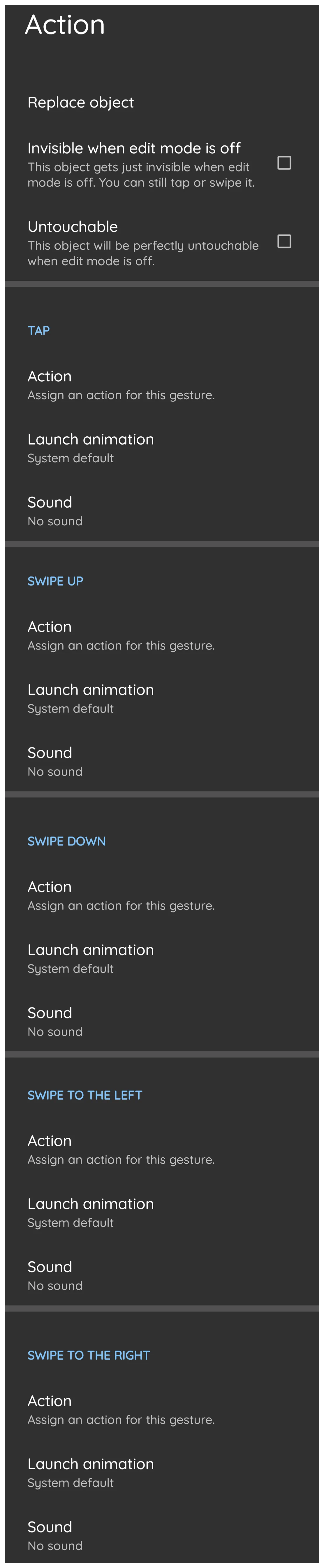
- Tap the top Object Design Menu Action icon
- The Action dialog opens (see image).
- Scroll to view the various actions available. In this example use
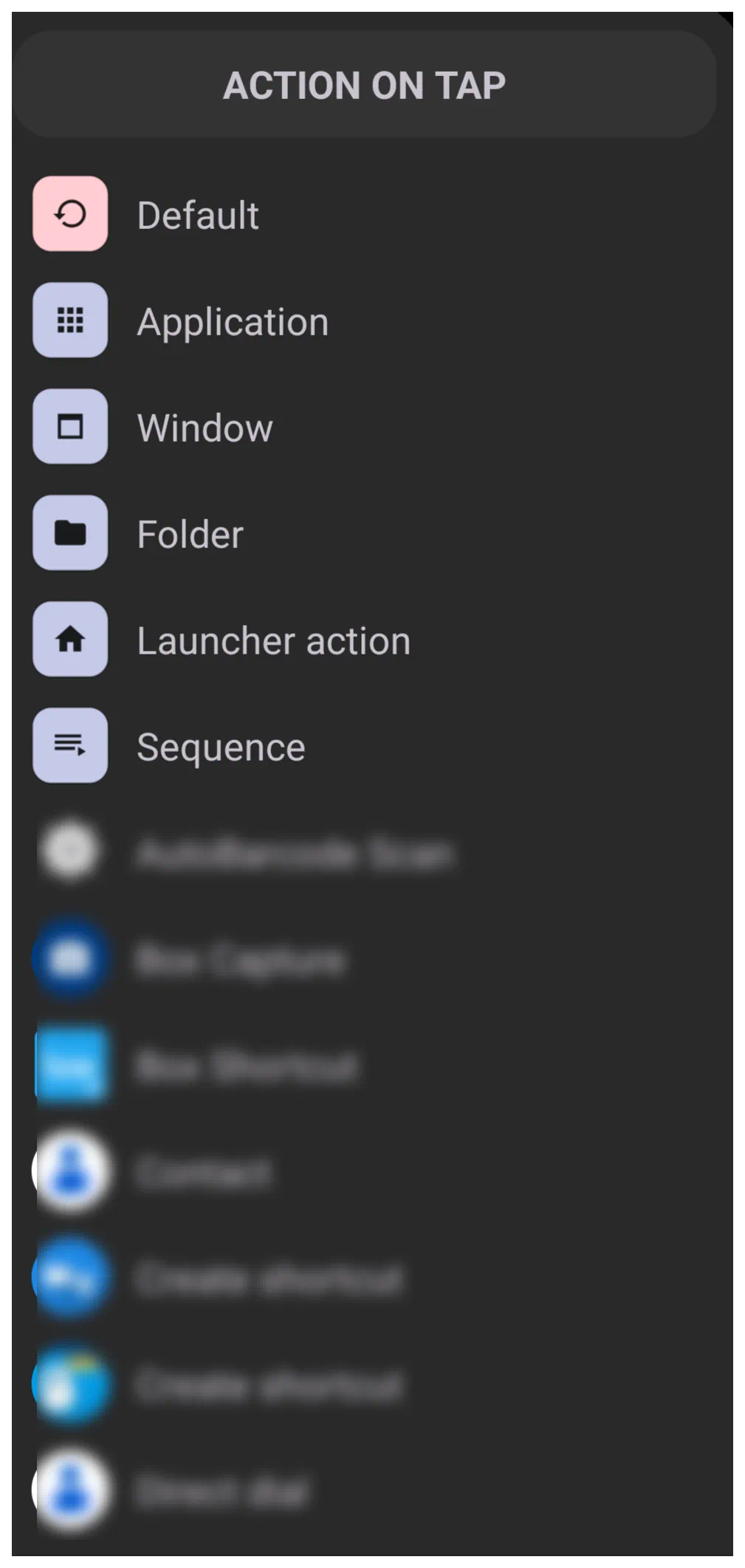
Tap- Select Tap >
Actionto open the Action On Tap dialog: (see image) - Select Window to open the Window-Portrait dialog (see image)
- Scroll the dialog to find and select the example
App_Widget_Window - TL now returns to the previous Action On Tap dialog (Tap) and shows the tap action will open the
App_Widget_Window - Back out to the page
- The window object icon is on the page. When tapped it will open the newly created App_Widget_Window.
- If the widget was not previously added, it can now be added.

Window: Add an Existing Widget to a Window after the Window Has Been Created
- There are two ways to add an object to a window:
- When creating a new window: as outlined in the dprevious procedure
- As an after thought … a window exists and a user wishes to add any object to the window, such as a widget. So, now at this point …
- Create the object to be added to an existing window:
- Enter Edit On mode
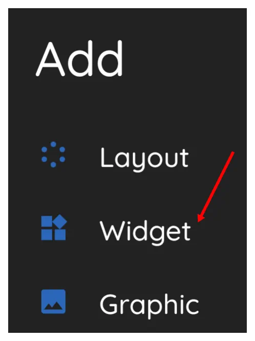
- From the top Object Design Menu select the Object Add icon
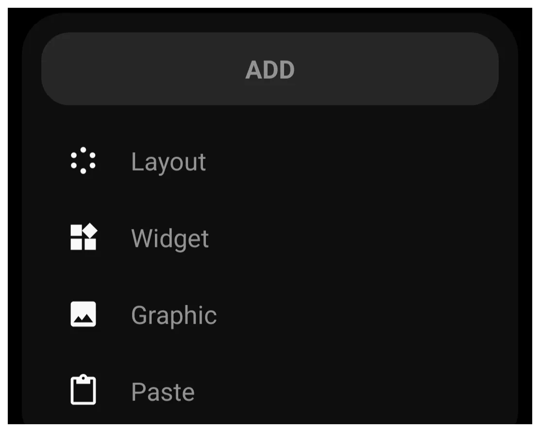
- The Add dialog opens (see image). Then …
- Select Widget
- Select any desired object, but in this procedure,
App drawer- Note: There are 3 types of application drawers and 1 contact “drawer”. Each has its own characteristics which can be confusing when really deep diving into their uniqueness. A full description and disection can be found at here at Widgets if desired.
- The App drawer widget is now on a page, centered. Tap-hold and drag to re-locate so that it does not block access to the other object(s) which will activate the window.
- The App drawer widget is on the screen and is selected, The following steps will place the widget within the window:
- Tap the Object Design Menu Copy icon
 which will remove the highlighting of the App drawer widget, but will change the Add icon to a new Add-Paste icon
- Now, to paste the copied widget into the window. Open the target window (tap the window widget)
- In the upper right corner, tap the
- From the Add dialog, select
Paste(see image)- The “App_Widget_Window” now contains the App Drawer widget
- Close the window by either tapping a blank space outside the window (if the full screen window has been down-sized earlier there should be enough edge space to do so) or by swipping right-to-left.
- The page still contains the original App drawer widget. Since that widget is now contained in the window, it is proper to delete the original App Drawer widget from the page.
- In Edit On mode, tap and hold the App Drawer widget to select it.
- Fron the Object Design Menu, select the Delete icon

- The Confirm - Remove Selections dialog opens. Select OK
- The widget is removed
The project is completed.
Comments & Feedback
Toby Lancer is ready to help! Look for the Quick Help form:
► Desktop: left sidebar located near the bottom for Private to Admin
► Mobile: 3-bar menu at page top.
► Use the Discussion section below to share any experiences and communications with other Total Launcher users.
► Any Registered User can directly update this and any wiki page if desired.
Moderation: To keep the manual clean, all comments are held for appropriateness review. Preview any comment before submitting it. It will not display after submission until reviewed. So, please, do not resubmit.
Formatting: If using any code snippets place them inside code tags (e.g., 'code') using double single quotes (') before and after to keep them readable.
Be Kind: This is a community effort. Please keep feedback constructive and on topic.
~~DISCUSSION~~