meta data for this page
robots=noindex,nofollow
Resource: Dynamic Image
Dynamic Image Resources provide state-responsive visual assets that evaluate internal Android conditions, sensor feeds, or live provider data to display context-appropriate graphics in real time. Rather than behaving as static bitmaps, a Dynamic Image operates as an array of condition-mapped image slots.
Once configured and saved in the central library (Edit mode > Launcher options > Resources > Dynamic image), a dynamic image can be used across multiple page objects, button states, window frames, or widget backgrounds, updating globally whenever the master resource changes.
Navigation & Interface Architecture
Dynamic images are managed and created through two access points:
- Global Resource Library:
Edit mode>Launcher options>Resources>Dynamic image(used to build and store reusable templates). - Object Insertion:
Edit mode>Edit on>Add>Graphic>Image>Default>Dynamic image.
Library Management & Aspect Ratios
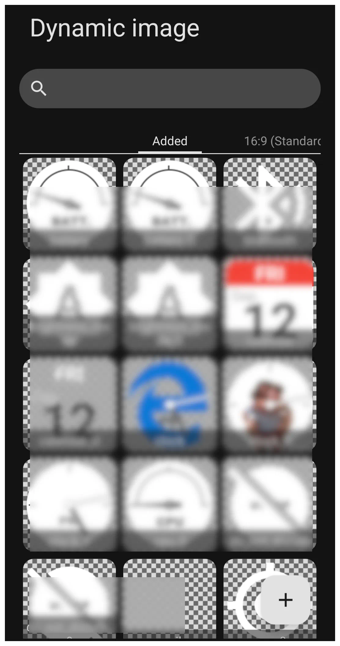
- Search (Magnifier): Filters saved and system dynamic image templates by label name.
- Added Tab: Displays all active custom dynamic image sets saved to the current layout theme.
- Aspect Ratio Tabs (e.g., 16:9, 19.5:9, 21:9): Manages preview proportions across varying screen dimensions to ensure radial sweeps, needles, and dials remain proportional on foldable devices or tablets.
- Add (+): Opens the Dynamic Image generator dialog to build a new asset pack from system presets.
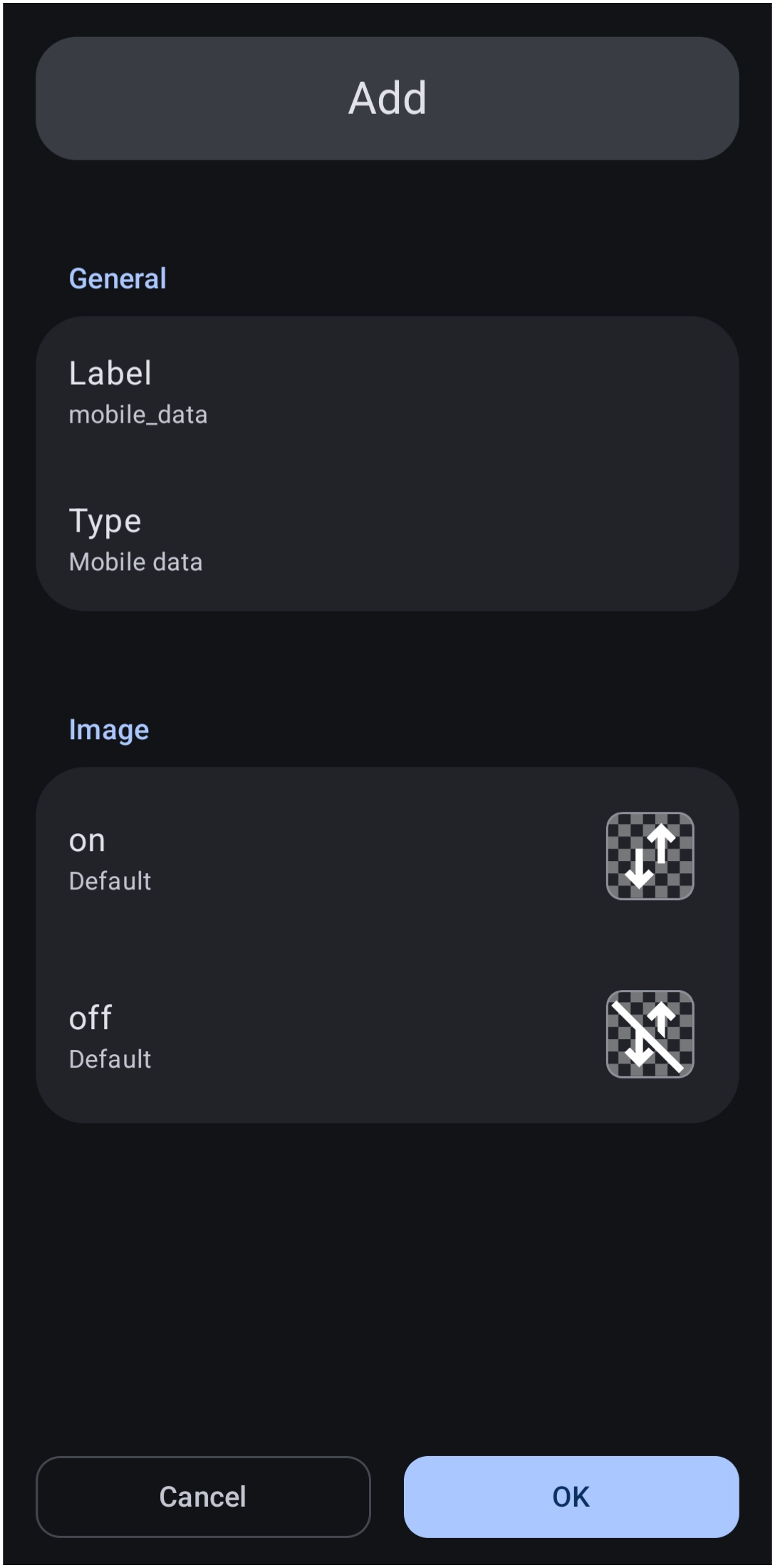
This next image is a sample dynamic image dialog (shown here is Mobile data) displays the default format.
The key elements in this image are:
- Label - The name or title the user assigns to the specific dynamic image.
- Type - While type here shows
Mobile data, there are 16 other types of dynamic images in the Launcher. See the full discussion below.
- Image - In this sample, Mobile Data has 2 images, or 2 slots. They represent On or Off images. Each “Dynamic Image” has its own number of designated slots (images) matched to a specific status; for example, Calendar or Weather has many more.
Dynamic Image Categories & State Mappings
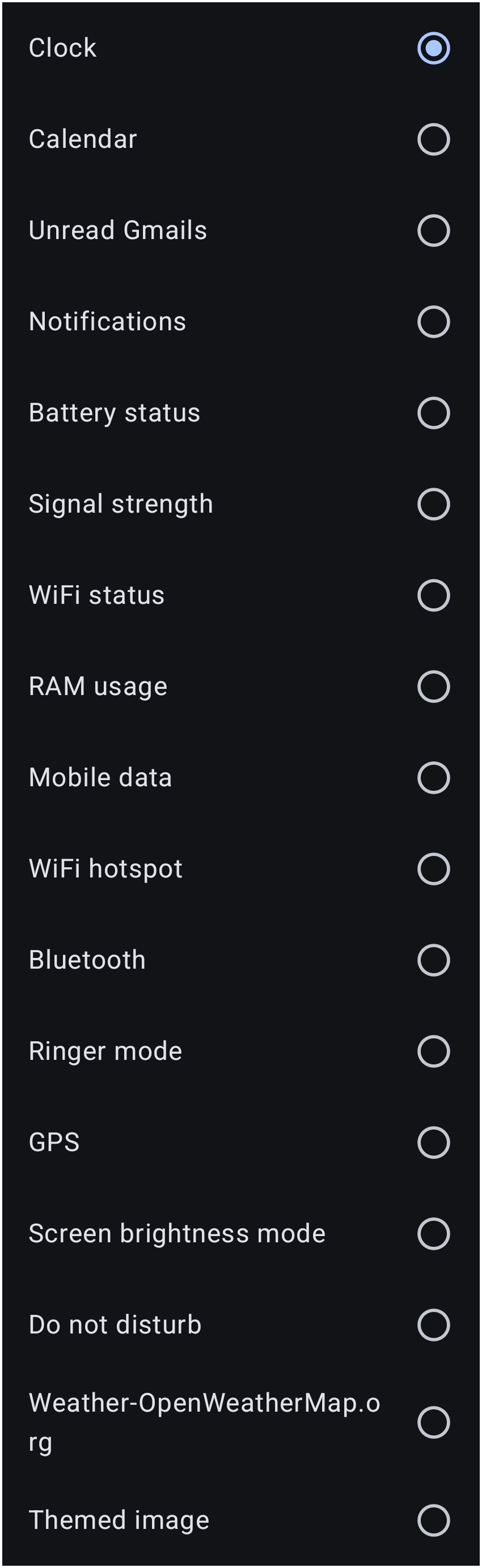
Selecting Type from this dialog provides access to 17 distinct functional categories:
| Category | Evaluated System State | Configurable Slot Behavior |
|---|---|---|
| Battery status | Charge level percentage (0% to 100%) and AC/USB charging flag. | Dial arc sweep or discrete percentage steps; includes a specialized bolt icon slot for charging state. |
| Bluetooth | Adapter state and active peripheral connections. | Binary state slots: on and off. |
| Brightness mode | Android system display brightness status. | Binary state slots: Automatic (ambient sensor active) and Manual. |
| Calendar | Current device system date. | Multi-tier slots: Background, 12 Months, 7 Days of the week, 31 Days of the month, and Foreground. |
| Clock | Internal system time. | Multi-tier slots: Background, AM, PM, 24 discrete hour slots (0:00 to 23:00), 60 minute slots (00 to 59), and Foreground. |
| Do not disturb | Interruption filter settings. | Binary state slots: on and off. |
| Gmails (unread) | Unread message counts from synchronized Google accounts. | Multi-state slots: 0, 1, 2 … through 10+. *(Note: Dependent on Android permission grants).* |
| GPS / Location | Hardware satellite sensor activity. | Binary state slots: on and off. |
| Mobile data | Cellular data connection state. | Binary state slots: on and off. |
| Notification count | Active system status bar notifications. | Discrete numeric slots: 0, 1 … 10+. Requires Android Notification Access permission. |
| RAM usage | Dynamic system memory consumption. | Percentage interval steps (0% to 100%) mapped to dial gauge graphics. |
| Ringer mode | Audio profile state. | Three-state slots: Normal, Silent, and Vibrate. |
| Signal strength | Cellular network carrier reception. | Five discrete reception levels: Disconnected, Level 1, Level 2, Level 3, and Level 4. |
| Themed image | Android OS Light / Dark mode configuration. | Two discrete slots: Light theme and Dark theme. |
| Weather (OpenWeatherMap) | Current conditions reported by location GPS. | 18 condition slots (e.g., Sky is clear (day), Shower rain, Snow, etc.). |
| WiFi hotspot | Portable access point tethering state. | Binary state slots: on and off. |
| WiFi status | Wireless network connectivity and signal quality. | Five discrete tiers: Disconnected, Level 1, Level 2, Level 3, and Level 4. |
The Layer Sandwich: Background, States, and Foreground
Complex dynamic categories (such as Clock and Calendar) utilize a three-stage stacking hierarchy to define the final graphic:
Background Plate → Dynamic Condition Slots → Foreground Frame
- Background Slot (Bottom Layer): Renders beneath all changing elements. Ideal for static watch dial faces, metallic instrument bezels, circular gauges, or calendar desk pads.
- Dynamic State Slots (Middle Layer): Swapped automatically as system conditions change (e.g., swapping from
16:00to17:00, or fromFew cloudstoRain). Any individual slot can be replaced with custom artwork. - Foreground Slot (Top Layer): Overlays on top of the dynamic states using transparent PNG or WebP assets. Useful for:
- Applying glass glare reflections across clock hands or dials.
- Centering mechanical watch cap screws over the hand axis.
- Cutout border masks that trim inner moving graphics cleanly.
4. Advanced Customization & Creative Layout Techniques
A. Full-Screen Dynamic Weather Wallpapers (Z-Order Stacking)
While Total Launcher uses standard Android bitmaps for root system wallpapers, a Dynamic Image can serve as a live environmental wallpaper via canvas layering:
- Add a Weather Dynamic Image as an object:
Add>Graphic>Image>Dynamic image>Weather. - Scale the graphic container to cover the entire page boundary (100% width, 100% height).
- In the Object Design Menu, send the object to the lowest layer using Lower Z-Order (or assign it to the page background layer).
- Position Date, Clock, and App Drawer items on top of it.
- Result: The wallpaper scenery automatically shifts between crisp sunshine, overcast skies, rain animations, or nocturnal starfields based on live local forecast updates.
See Dynamic Images - Weather for more details.
B. The Invisible Zero-State (Auto-Hiding Badge Notifications)
When designing counters for notifications or unread Gmails, standard notification dots can clutter minimal designs when no alerts exist:
- Open the Dynamic Image set for Notification count or Gmails (unread).
- In the 0 slot, assign a completely transparent 1×1 WebP or PNG graphic.
- Populate slots 1 through 10+ with colored badge graphics or numbered circles.
- Result: The notification graphic remains completely invisible during zero-alert states, only appearing on screen when unread messages arrive.
C. Native System Light/Dark Theme Adaptation
Modern Android versions (Android 10+) broadcast an operating system flag (UI_MODE_NIGHT) when switching between Light and Dark themes via scheduled sunset times or the Quick Settings panel.
- Creating a Themed image allows two completely different graphic designs to occupy the same object space.
- Assign light, pastel, or low-contrast icons to the Light theme slot.
- Assign dark, high-contrast, or neon-accented icons to the Dark theme slot.
- Total Launcher listens natively to the Android OS broadcast and swaps the visible graphic instantly without requiring a separate theme profile reload.
D. Selective Time Customization
If an analog or digital clock requires a specific visual change at a single hour (such as changing color during evening hours), the entire 24-hour set does not need to be rebuilt:
- Only modify the target hour slot (e.g.,
17:00for 5:00 PM). - Unaltered slots will continue to render the default clock assets.
- Total Launcher triggers the customized graphic exactly at 17:00:00 and returns to the default profile when the hour completes.
E. Building a Dynamic Battery Level Ring: The Native Approach → The Circle Indicator Widget
- Add the Circle Indicator Widget:
- Long-press an empty space on the home screen, select Add > Widget, and choose Circle indicator from Total Launcher's built-in widget selection list.
- Verification: The Circle indicator configuration dialog opens immediately on the screen.
- Select the Target Resource:
- In the configuration dialog, tap the Target option.
- From the list of available device resources, choose Battery.
- Verification: The preview reflects the `% available` battery metric rather than RAM or Storage.
- Style Color and Background:
- In the same dialog:
- Color: Tap to choose the stroke/meter color using either the standard Color Picker or dynamic color definitions.
- Background: Optionally define the widget container's background (e.g., solid color, shape, or empty/transparent).
- Margins: Adjust container margins if needed for layout alignment.
- Verification: The indicator preview shows the chosen palette and container styling.
- Confirm and Place:
- Confirm selections to place the widget on the layout.
- Verification: The radial battery ring appears on the screen and accurately mirrors the current battery percentage.
Creating a Live Calendar Icon Badge
- For a fully customizable live calendar badge (like the top-red calendar frame with today's date centered inside) that does not rely on whether an icon pack supports dynamic calendar intents, build it directly using a layered Image/Text object:
- Add the Background Graphic:
- Long-press any empty space on the screen and select Add > Graphic (or Image). Load the calendar frame artwork (e.g., the white card with the red header). Tap the checkmark to place it.
- Verification: The calendar frame sits on the screen and can be moved or resized.
- Add the Dynamic Date Text:
- Long-press the screen, choose Add > Text, and tap the Edit (pencil) icon to open text properties.
- In the text field: Tap the dynamic tag button (or type the date format variable 'd' for single-digit or 'dd' for two-digit day).
- Under text style, set Alignment to Center, choose the font, and set the text color to #FF212121.
- Verification: The text object displays the current numerical day of the month on the screen.3.Position and Group:
- Drag the date text directly over the body of the calendar graphic.
- Long-press to enter multi-select mode, select both the graphic and the text, and tap Group.
- Verification: Dragging either item moves the entire calendar icon as one unified element.
- Assign the Tap Action:
- Select the newly created group, tap the Edit (pencil) icon, navigate to Action, and set it to Launch application > select the preferred Calendar app.
- Verification: Tapping the badge launches the calendar app immediately.
Recommended External Image Repositories & Tools
To populate custom dynamic image slots with cohesive assets, transparent PNG or WebP collections designed for open interface systems can be utilized:
- Erik Flowers Weather Icons: Comprehensive collection of over 200 standardized meteorological vector graphics and web assets ready for OpenWeatherMap mapping.
URL: https://erikflowers.github.io/weather-icons/ - IconArchive Weather Collections: Free downloadable PNG icon sets sorted by style (realistic, flat vector, monochrome glyphs) on transparent backgrounds.
URL: https://www.iconarchive.com/tag/weather - Open Clipart Library: Public-domain vector collection providing complete sets of moon phases, dial gauges, and weather art.
URL: https://commons.wikimedia.org/wiki/File:Weather_icon_-_complete_set.svg

Asset Preparation Tip:
When importing custom artwork for dials, clocks, or weather states, maintain consistent square dimensions (e.g., 256×256 or 512×512 pixels) and convert assets to `.webp` format to minimize memory consumption while preserving transparency.
Also see the UI Section on Dynamic Images.