meta data for this page
Layout - List
Dialog selections are discussed below the image. To navigate to an item, select it in the List Layout image.
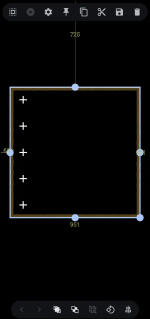
List Layout Object Design screen. Make selection above.
List Layout
The page after selecting the List layout, with the 'list' selected. It provides spatial positioning, canvas boundaries, and action toolbars for linear vertical container arrangements.
Steps to Complete the List Layout
The user will customarily follow these steps to complete the list layout setup:
- The container with the 5 default object placeholders can be moved to another location by tap/hold/dragging the center of the selected container itself. Individual object placeholders cannot be moved independently, only in tandem.
- The 5 default placeholders can be increased or decreased by using the Object Design menu Options
 icon which will open the Option Edit dialog shown here . While this interactive demo cannot apply a list layout, those wanting to explore these Options for further interaction and explanation can tap the Option icon in the List Layout dialog at the top of this page.
 - To assign an action to a
+placeholder:- Deselect the List Layout container by tapping an empty space outside of the layout placeholder.
- In this demo, tap an empty space in the List Layout dialog at the top of this page or tap here to navigate there. Otherwise, tap here read what would happen .

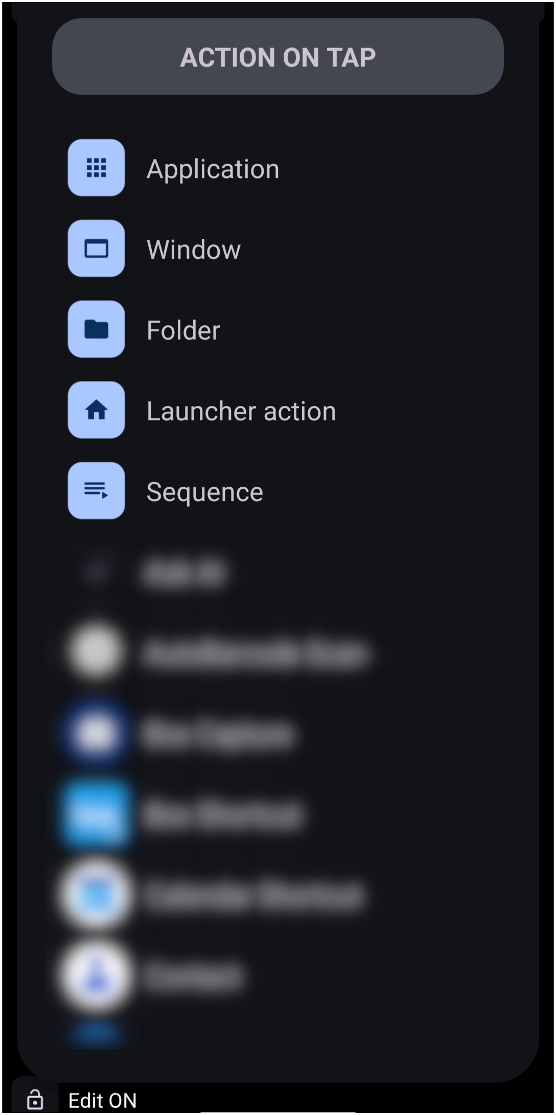
List Layout Objects Description
List objects
- List objects
 : Placeholders, shown in Edit On mode, for the layout objects. The default “List Layout” contains 5 vertically aligned objects, with the layout container shown as selected. Tapping outside the boundary deselects the layout. At that time, a tap on a
 +will activate anActiondialog for selection of which action is desired (application, window, sequence, etc.)- Coordinate Markers (725, 65, 951): Real-time pixel distance markers from canvas edges. (not adjustable in this demo)
- Anchor Nodes (Blue Handles): Boundary adjustment handles located at midpoints and corners to scale width and height. (not adjustable in this demo)
Other objects on this page are described below. For items that are not actionable in this demo, provide a video of the action or user involvement in the selection.
Object Design Menu (Top)
Notice the Object Design Menu at both the top and bottom of the screen. The icons contained in these menus describe what will happen or what options are available for the selected object. Read below and view a demo of what happens when specific icons are selected.
TOP 
Selection
 - Once the selection icon is tapped, the user can drag left to partially intersect any selected object or right to fully select any object.

Action
 - This would normally enable the object's action when tapped or swiped, such as application, folder, or calendar. However, since the “layout” is selected, the
 Action icon is grayed out. A user will want to assign “actions” to the objects within the list layout. To accomplish that, tap an empty area to deselect the layout. This changes the Launcher focus from Object Design mode to Page Design mode, enabling a user to tap the layout's + icons to assign actions.
- To navigate to that interactive ui page, tap here.

Option
 - Tap to open the Options Edit dialog for setting the number of rows, launch sounds, icon, labels, and background features.
- Navigate to the interactive demo for the Layout List Options.

Pin
 - With an object selected and then the pin icon tapped, the object will now be visible in its current location on all pages of the setup.


Copy
 - Creates a copy of the object, which can then be pasted using the Object Add (+) - Paste option. The new copy will be placed on top of the existing object but can be selected and moved to the desired location.


Cut
 - Removes the object from the screen location and allows the user to then paste the item to another location (such as another page) using the Object Add (+) - Paste option.


Save
 - places a copy of the object in the Resource's “Saved” folder for future access


Delete
 - Removes the object from the page with no saving


Object Design Menu (Bottom)
BOTTOM 
Selection: Back - Forward
 Back - Grayed out in this image (inactive) since all objects on the page were selected. If multiple unselected objects exist, the user can cycle through all objects by tapping the icon, then proceed with modifying the selected object.
- For both the back and forward icons, see a demo here .
 Forward - Grayed out in this image (inactive) since all objects on the page were selected. If multiple unselected objects exist, the user can cycle through all objects by tapping the icon, then proceed with the object's modification.


Z-order: Front - Back
 Front - Grayed out in this image (inactive) since all objects were selected. If multiple overlapping unselected objects existed, this would bring the selected object to the front “layer” to appear before other objects.
 - For both the Z-order Front and Z-order Back icons, see a demo here .
 Back - Grayed out in this image (inactive) since all objects were selected. If multiple overlapping unselected objects existed, this would move the selected object to a “layer” behind other objects.


Group
 Group - While the 3 objects in this image are selected, they are currently separate objects. Tapping this icon groups the 3 objects into a single object. This is useful when needing to move the group items at the same time.


Rotate - Transform
 Rotate - Transform - Grayed out in this image (inactive) since more than 1 object is selected. If only a single object is selected, tapping the icon opens the rotate-transform dialog to rotate the object around its x or y axis and adjust its rotation, scaling, and translation… It's complicated, so experiment to learn.


Align
 Align - Grayed out in this image (inactive) since all objects in the image were selected. If multiple objects exist, the user taps the align icon, which reveals a horizontal or vertical alignment bar when it intersects another object. This is useful for centering or matching top/bottom areas of objects.


===== Hidden Index Anchors ===== ui-layout-list-deselected
Comments & Feedback
Toby Lancer is ready to help! Look for the Quick Help form:
► Desktop: left sidebar located near the bottom for Private to Admin
► Mobile: 3-bar menu at page top.
► Use the Discussion section below to share any experiences and communications with other Total Launcher users.
► Any Registered User can directly update this and any wiki page if desired.
Moderation: To keep the manual clean, all comments are held for appropriateness review. Preview any comment before submitting it. It will not be displayed after submission until it is reviewed. So, please, do not resubmit.
Formatting: If using any code snippets, place them inside code tags (e.g., 'code') using double single quotes (') before and after to keep them readable.
Be Kind: This is a community effort. Please keep feedback constructive and on topic.
~~DISCUSSION~~