meta data for this page
Note: The image below is a static preview and contains no clickable dialogs. To navigate away after reviewing:
- Go Back: Return to the Widget Select page or use the browser's back arrow (swipe right-to-left).
- Explore: Choose a new topic from the left sidebar menu.
Widget: App Group
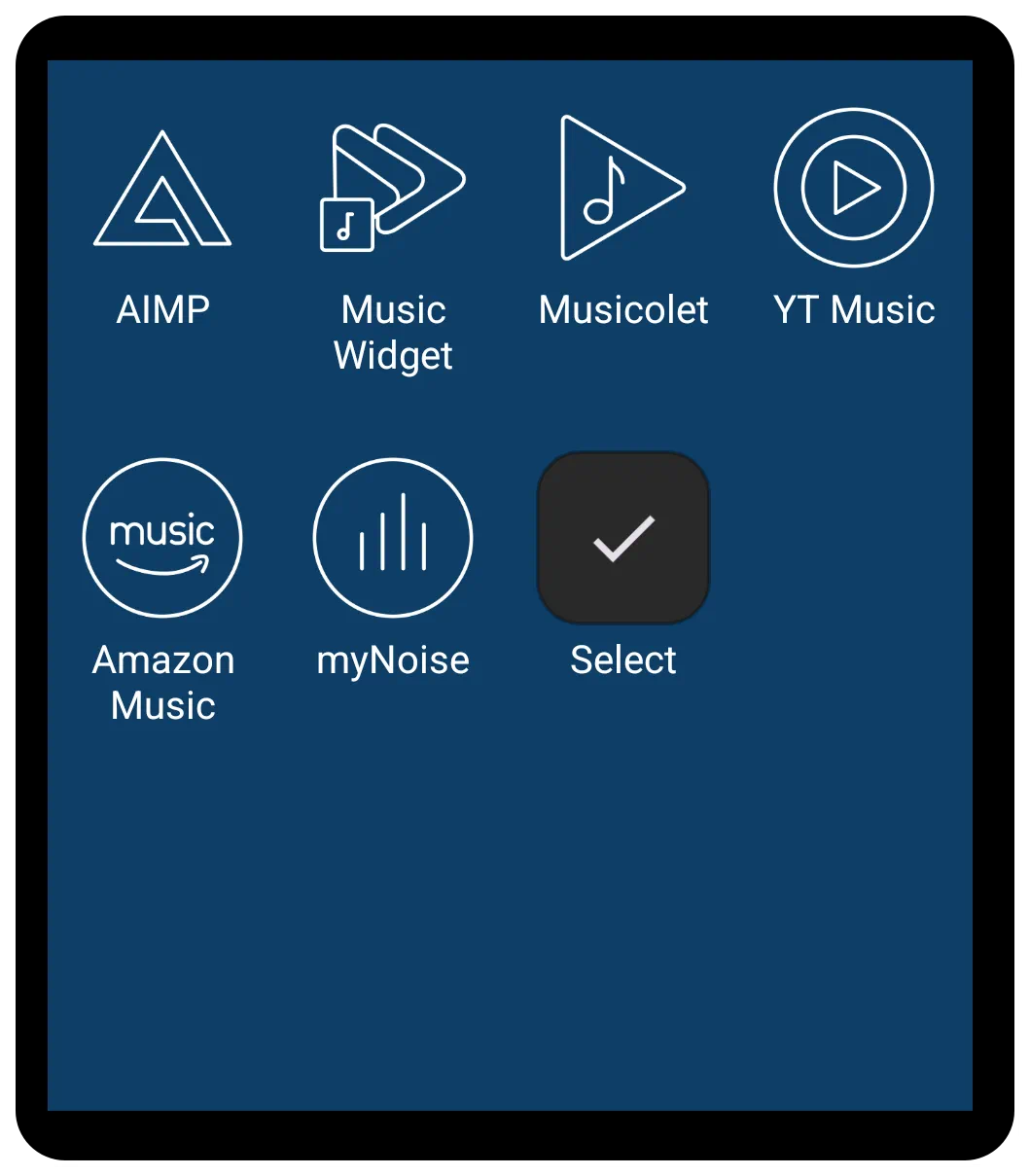 | The App Group shares many core customization and aesthetic features with the App Drawer widget but does have some differences noted below. It allows users to create specific groups, which makes it ideal for creating static docks, categorized groups (like “Work Apps” or “Games”), or quick-access panels, rather than displaying all applications on the device (which is the primary function of the App Drawer). |
Customizable Application Container
The App Group widget primarily displays a focused selection of icons, relying heavily on user organization and selection. This selection can include applications, windows, folders, or shortcuts.
Functions and Tagging
The fundamental purpose of the App Group is to act as a grouping container as determined by the user. Once set by the user, it will not automatically update.
- Tagging: App Group differs from App Drawer in that tagging is not available within the drawer since there is no menu system. Tagging can still be done through the App Drawer but cannot be set anew within the App Group. This should not be a significant loss when deciding to use this widget, since the quasi-tag system by group already populates the widget with the desired objects/folders.
Layout, Display, and Quick Scrolling
The App Group widget provides extensive control over its layout, supporting both grid and list formats:
- Layout Type: The widget can be toggled between Grid type or List type.
- Grid Dimensions: When set to Grid type, users can define the number of Columns (ranging from 1 to 16) and Rows (ranging from 1 to 16) to fit the required space on the page, window, or sliding drawer.
*Scrolling: The layout supports vertical scrolling, which is essential for displaying numerous items. Users can customize the scrolling experience using options such as system scroll animation, snap scroll (to ensure items settle without being cut off), hide scrollbar. Notably, the App Group currently does not support horizontal scrolling (paging) like the specialized App Drawer (pager).
- Menu: Search, Tag, Sort: No menu system for tag, search, or sort is available.
Customization Highlights
App Group shares the rich visual customization settings found in the App Drawer when in Edit On mode and selected:
- Aesthetics: Customization is accessed by selecting the widget and tapping the Options icon (gear) in the top menu bar.
- Icon Settings: Detailed control over icon appearance is provided, including adjustment of Icon size, Icon opacity(%), Icon saturation(%) (to control color intensity), Icon padding (margins around the icon as a percentage of size), and applying an Icon color filter.
- Shared Options: There is no Shared Options tab in the Option Edit dialog. See below for options which are editable within the widget.
- Label Settings: The label (the text beneath the icon) can be enabled or disabled. Further control includes choosing the Typeface (font), setting the Font size, and modifying the horizontal spread using Scale X(%). Shadow effects for the label are also available through settings such as Shadow color, Shadow radius, and Shadow offset X/Y.
- Background and Spacing: The appearance of the container and the items within it can be fully customized, including setting the overall widget Background and background for individual items (Item background, Item background (pressed), Item background (focused)). Users can also manage spacing using Margins around the widget and Item spacing between the icons. If no margins or spacing are set, items may fill the entire grid area, covering the main widget background color.
- Animation
- Enter Animation: This is a widget animation which occurs when returning to the page occupied by the widget.
- See more detailed discussion here.
Comments & Feedback
Toby Lancer is ready to help! Look for the Quick Help form:
► Desktop: left sidebar located near the bottom for Private to Admin
► Mobile: 3-bar menu at page top.
► Use the Discussion section below to share any experiences and communications with other Total Launcher users.
► Any Registered User can directly update this and any wiki page if desired.
Moderation: To keep the manual clean, all comments are held for appropriateness review. Preview any comment before submitting it. It will not be displayed after submission until it is reviewed. So, please, do not resubmit.
Formatting: If using any code snippets, place them inside code tags (e.g., 'code') using double single quotes (') before and after to keep them readable.
Be Kind: This is a community effort. Please keep feedback constructive and on topic.
~~DISCUSSION~~