meta data for this page
Phase 2: The Canvas (Structure & Workflow)
Now that styling an object is better understood, how is it placed on an object? Total Launcher is not just a grid of icons; it is a free-form design canvas. This phase covers the architecture: Pages, Windows, Layouts, and Positioning.
The Hierarchy
Understanding the container hierarchy is critical for troubleshooting.
- The Screen: The physical display of a user device.
- The Page: The main workspace (Home Screen) … and multiple pages are also possible.
- The Window: A floating container that sits above the page. (Used for pop-ups, sidebars, or overlays).
- The Layout: A group of objects anchored together (like a grid of icons).
- The Object: The individual item (Icon, Text, Widget).
Page Management
Total Launcher allows extensive management of screens and pages.
- Adding/Removing Pages: Enter Edit mode. By default, the setting is off. When viewing this screen make sure to tap the
Editicon to turn the Edit On . TheNew pageheading indicates that a 'new page' can be created. Swipe right to view the page placeholder. Then tap+to create a new page. Pages do not require labels, but labels are used for Launcher Actions, such asGo to page …. Therefore, labels are recommended to be entered here. Tap the “New Page” icon to add, or the “Trash” icon
  to remove the current page (shows in the center of the screen).
 - Arranging Pages: In the page overview, use the
Swap Button to exchange positions of pages.
 - The Home Page: Indicated by a
House Icon . To change the default home page, swipe left or right to center the desired page on the screen. Tap the house icon to set it as 'Home'.
 - Scrolling:
- Horizontal: Standard swiping between pages.
- Vertical: Each page can be individually set to “Scroll Vertically” in Options
 . Just
 turn ontheFit the content to the screen height (disable scrolling)button. Then follow this setup procedure. This allows for an almost infinite-scrolling page, similar to a social media feed.
- Orientation: Total Launcher supports independent page designs for Portrait and Landscape modes. Arrange objects separately for each orientation by tapping the Background icon
 and selecting
 Portraitand/orLandscapefor each device orientation.





Layouts (Grids & Circles)
While objects can be placed freely, “Layouts” are containers that snap objects into a structured arrangement.
- Grid Layout: Snaps items into rows and columns.
- Customization: Adjust
ColumnsorRows(1 to 16).
- Circle Layout: Arranges items in a perfect circle.
- Customization: Adjust the size, rotation angle, and even transform it to unique viewpoints, or select the option to make it a Fidget spinner.
- Why use a Layout?
- Automatic Spacing: If resizing a Grid Layout, all icons inside resize and space themselves automatically.
Objects, such as icons and folders, can be placed anywhere on the page.
See "How To Add An Application Shortcut To The Page".
Grouping vs. Layouts
New users often confuse these two features.
- Layout: A container that forces items into a grid/circle. You cannot drag items freely inside it.
- Group: A selection of free-floating objects glued together.
- How to Group: Highlight multiple objects by a tap/hold. This activates the Object Design Menus. In the bottom menu, tap the
Groupicon .
. - Benefit: This enables the entire group to be moved, rotated, or animated as one unit (e.g., a “Music Player” group containing Play, Pause, and Album Art objects).

Anchoring & Screen Adaptation
When moving or sharing themes between devices with different screen sizes (aspect ratios), objects can shift unexpectedly. Total Launcher uses two positioning modes to fix this.
- Top Anchor (Default):
- Behavior: Objects are positioned based on their distance (Y-axis) from the Top of the screen.
- Best for: Headers, Clocks, and Status Bars.
- Bottom Anchor (The “Fit Content” Mode):
- Problem: On a taller screen, a “Dock” anchored to the top might float in the middle of the screen.
- Solution: Enable
Fit content to the screen heightin thePage Options.- How to set: Once enabled, select the object and use the Y-Position entry to adjust alignment to the desired position, and select the

 icon on the Object Design menu (bottom) to reflect top or bottom priority.
- Best for: Docks, Navigation Bars, and Footers. This ensures stability across different devices.


Pinning
- Behavior: A pinned object floats above the page system, appearing on every page in the exact same location.
- Action: With Edit mode On, select the object to activate the Object Design Menu. In the top menu, tap the
Pinicon .
.

Z-Order (Layers)
Objects in Total Launcher sit in layers, like a stack of papers.
- The Issue: When a large transparent shape is placed over a button, the button becomes unclickable because the shape is blocking the touch.
- The Fix:
- Access: With the desired object selected and the Object Design Menu (bottom) activated, then:
- Bring to Front:
 - Moves the object to the top of the stack.
 - Send to Back:
 - Moves the object behind everything else (ideal for Background Shapes).


The Grid vs. Free Positioning
- Snap-to-Grid: By default, objects in
Edit Onmode, when selected, will snap to invisible grid lines for neatness when manually moved. - Nudging: For pixel-perfect precision, still in Edit On mode with the object selected, quickly tap one of the
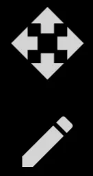
Edit elements to use the directional arrow keys to finitely move an object or the
 pencilto manually adjust the position coordinates 1 pixel at a time.
Comments & Feedback
Toby Lancer is ready to help! Look for the Quick Help form:
► Desktop: left sidebar located near the bottom for Private to Admin
► Mobile: 3-bar menu at page top.
► Use the Discussion section below to share any experiences and communications with other Total Launcher users.
► Any Registered User can directly update this and any wiki page if desired.
Moderation: To keep the manual clean, all comments are held for appropriateness review. Preview any comment before submitting it. It will not be displayed after submission until it is reviewed. So, please, do not resubmit.
Formatting: If using any code snippets, place them inside code tags (e.g., 'code') using double single quotes (') before and after to keep them readable.
Be Kind: This is a community effort. Please keep feedback constructive and on topic.
~~DISCUSSION~~