meta data for this page
Folder Style
Dialog selections are discussed below or next to the image. There are no navigation selections within the image. To return to the previous page, swipe (right to left), use the browser's return arrow, or select the Backlink icon  from the right sidebar.
For navigation to this dialog in the app:
- When creating a new folder:
Edit ON>Design Menu ☛ Object Add>Graphic>Image>Folder>Tab ☛ Folder Styleor
- When an existing folder in on the page:
Edit ON> slight tap folder to open top Edit menu bar >Edit(pencil)
 |
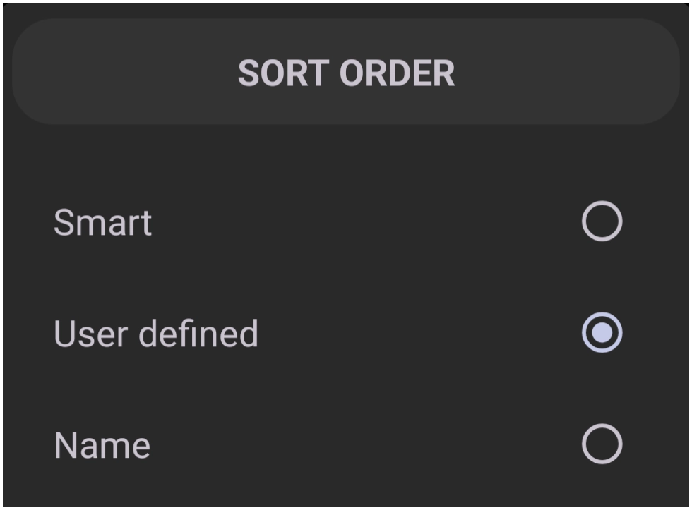
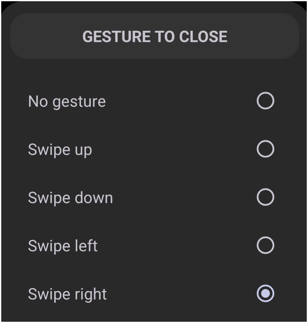
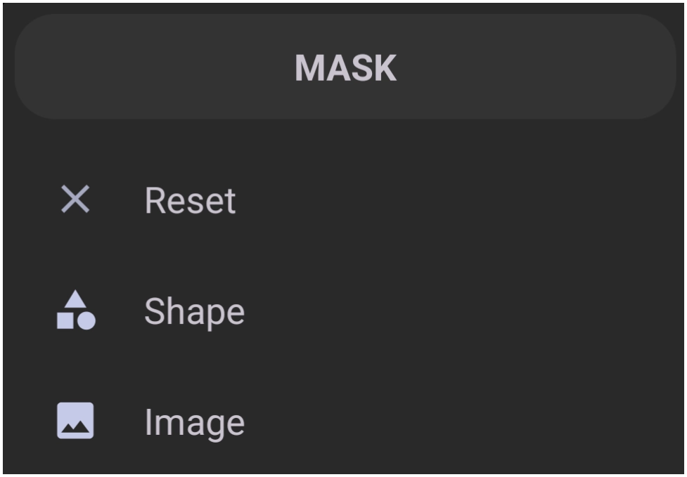
| This dialog screen shows options for: General: • Max column number - Defines the maximum number of columns (range 2 - 10) for items displayed within the folder. • Max row number - Defines the maximum number of rows (range 2 - 10) for items displayed within the folder. • Item width - Sets a specific width for items inside the folder. The range is 0 - 575, with a default of 0, which represents approximately a 275 setting. Less than shrinks < 275 > greater than enlarges.• Item height - Sets a specific height (or vertical separation) for items inside the folder. The range is 0-862, with a default of 0, which represents approximately a 375 setting. Less than decreases < 375 > and more than increases.• Sort order - Determines how items inside the folder are arranged, such as by • User defined • Name or • Smart (frequency of use). See the dialog here. • System scroll animation - Check the box to enable the device system to control animation when scrolling through folder contents. • Animation duration (ms) - Sets the length of the opening and closing folder animations in milliseconds, with a range of 0 - (400 default) - 800. • Center in the screen - Activate this button to align the opened folder to the exact center of the device screen. • Gesture to close - Assigns a specific swipe gesture to close the open the selected folder. See the dialog here. • Entering or Exiting sound - Selects a 'Resource' audio file to play when the folder is opened or closed. All 'Resource' areas (image, sound, window, shape, etc.) must have objects imported or be user-created versus pre-installed. See the dialog here. Background • Background - Sets the primary background to 1 of 5 options for the open folder window. Navigate here to see more options. • Show shadow - Activate the button to enable a drop shadow visual effect behind the open folder (not the object representing the folder, such as an icon, on the page. • Margins - Adjusts the interior spacing on the left, top, right, and bottom of the folder container. Navigate here for a full understanding of the effect of margins. • Item background - Sets a background color or image for individual items within the folder. Navigate here to see more options. • Item background (pressed) - Sets the background color or image displayed when an item is actively pressed. Navigate here to see more options. • Item background (focused) - Sets the background color or image displayed when an item is highlighted. Navigate here to see more options. Icon: • Icon size - Adjusts the visual dimensions of the icons displayed inside the folder using the slider or manual entry using the text box. • Icon opacity(%) - Sets the transparency level of the icons inside the folder via the slider or text box. • Icon saturation(%) - Adjusts the color intensity of the icons inside the folder. • Icon color filter - Applies a specific color overlay or filter to the folder icons. See the dialog here. Label: • Show label - Toggles the visibility of text labels positioned beneath the icons inside the folder. • Typeface - Selects the specific font style used for the item labels. Navigate here to see more options. • Label lines - Determines the number of text lines (range 1 - 3) used for the item labels in the folder. • Font size - Sets the typographic size of the text used for the item labels with a range of 0 to 100 using the slider or text box.• Scale X(%) - Adjusts the horizontal width scaling of the text labels using the slidger or text box. • Text color - Sets the primary color for the text labels. Navigate here to see more options. • Text color (pressed) - Sets the color of the text label when the corresponding item is actively pressed. Navigate here to see more options. • Shadow radius - Defines the blur intensity for the shadow effect rendered behind the text labels. Set to 0 to disable. The maximum shadow radius is 20'.• Shadow offset X - Controls the horizontal distance (x-axis) of the text shadow from the label with a range of -50 (left) to 50 (right) with 0 showing no shadow.• Shadow offset Y - Controls the vertical distance of the text shadow from the label with a range of -50 (above) to 50 (below) with 0 showing no shadow.• Shadow color - Sets the color used for the text label shadow. Navigate here to see more options. Thumbnail Icon Style: • Icon layout - Configures the visual arrangement and style of the mini-icons when displayed as a thumbnail on the home screen. See the dialog here. • Icon scale(%) - Adjusts the size of the thumbnail mini-icons relative to the folder's exterior icon. The range is 0 to 100 with the current state being shown at 0.• Icon offset X(%) - Shifts the horizontal position (x-axis) of the thumbnail mini-icons within the folder icon with a range of -100 to 100 with 0 being the initial state.• Icon offset Y(%) - Shifts the vertical position of the thumbnail mini-icons within the folder icon with a range of -100 to 100 with 0 being the initial state.• Background - Defines the background image or color for the closed folder's exterior thumbnail icon. Navigate here to see more options. • Foreground - Defines a foreground overlay image or color for the closed folder's exterior thumbnail icon. Navigate (need new image) here to see more options. • Mask - Applies a geometric shape mask to crop or frame the folder's exterior thumbnail icon.See the dialog here and learn about applying folder masks here and here. |


You could leave a comment if you were logged in.
Comments & Feedback
Toby Lancer is ready to help! Look for the Quick Help form:
► Desktop: left sidebar located near the bottom for Private to Admin
► Mobile: 3-bar menu at page top.
► Use the Discussion section below to share any experiences and communications with other Total Launcher users.
► Any Registered User can directly update this and any wiki page if desired.
Moderation: To keep the manual clean, all comments are held for appropriateness review. Preview any comment before submitting it. It will not be displayed after submission until it is reviewed. So, please, do not resubmit.
Formatting: If using any code snippets, place them inside code tags (e.g., 'code') using double single quotes (') before and after to keep them readable.
Be Kind: This is a community effort. Please keep feedback constructive and on topic.
~~DISCUSSION~~