meta data for this page
Folder Thumbnail Foreground
Dialog selections are discussed below the image. For navigation to an item, make a selection in the Folder Thumbnail Foreground image.
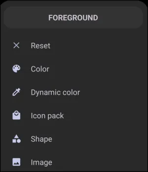
Folder Thumbnail Foreground dialog. Make selection above.
The foreground dialog is typically used to focus on an icon, symbol, or graphic representation, such as an image or shape, to highlight the object's purpose. Options here are described below:
- Reset - When selected, the user is returned to the originating page without any changes being activated. If in trouble, it is a “Get out of jail, free!” card.
- Color - Allows for the selection of ARGB colors using Total Launcher's Color Picker utility. For Text, Shapes, Layouts, and Windows, this is a very usable background element. Foregrounds generally require high opacity or solid visibility to remain legible and easily identifiable. Therefore, a contrast to the background is usually desirable.
- Dynamic color - The point made in the previous feature “Color” can also apply here in Dynamic Color. Both are “colors”. Dynamic color is a feature based on Android's Material You design language and a system that adapts the Launcher’s color palette based on the user's wallpaper or theme and must be activated within Total Launcher at
Main Menu>Launcher Options> '' UI & Animation'' >User interface> '' Dynamic color scheme''. It uses predefined roles, like “Primary”, “Secondary”, “Error”, to apply consistent and appealing colors across different UI elements based on the user's setup color scheme. See Customize Dynamic Color for more information. - Icon Pack - Icons or icons from icon packs can be used in foregrounds mostly as an opaque image or in a modified transparency mode which rests behind a foreground such as text or another graphic. These icons can come from applications, be included in Total Launcher's built-in icons, or be downloaded from the Google Play Store.
- Shape - Shapes, with their color and gradient fills, can satisfy nicely as backgrounds, but again, have the same cautions as basic color, dynamic color, and icon packs: opaque qualities can cause issues. Shapes can also be used to blur a wallpaper background.
- Image - Displays the launcher's Resource category for image storage.
===== Hidden Index Anchors ===== ui-folder-options-folder_style ui-color_picker ui-dynamic_color ui-folder-options-icon_pack ui-launcher_options-resources-shape ui-launcher_options-resources-image
You could leave a comment if you were logged in.
Comments & Feedback
Toby Lancer is ready to help! Look for the Quick Help form:
► Desktop: left sidebar located near the bottom for Private to Admin
► Mobile: 3-bar menu at page top.
► Use the Discussion section below to share any experiences and communications with other Total Launcher users.
► Any Registered User can directly update this and any wiki page if desired.
Moderation: To keep the manual clean, all comments are held for appropriateness review. Preview any comment before submitting it. It will not be displayed after submission until it is reviewed. So, please, do not resubmit.
Formatting: If using any code snippets, place them inside code tags (e.g., 'code') using double single quotes (') before and after to keep them readable.
Be Kind: This is a community effort. Please keep feedback constructive and on topic.
~~DISCUSSION~~