meta data for this page
- en
<!-- googleoff: index -->
⚠️ v4.0 UI Transition Notice - In Process: The release of Total Launcher v4.0 has introduced significant user interface changes. Please note that this page does not yet reflect these updates. The new layout paths, folds, and visual maps are currently being compiled and will be deployed shortly.
<!-- googleon: index -->
<insert previous page>
Mixed Graphic - Phone (Green Square) Action
Dialog selections are discussed below the image. For navigation to an item make a selection in the Mixed Graphic - Phone (Green Square) Action image.
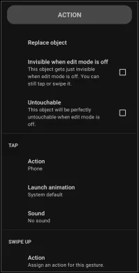
Mixed Graphic - Phone (Green Square) Action dialog. Make selection above.
- Replace Object - tap this to “start over” with a new built-in graphic for the user to select. While the selected new graphic is placed on the page, the “action on tap” link remains unchanged, i.e. changing a phone built-int graphic to a calendar event, the “action on tap” would remain “phone”
- Action - opens the action dialog list to select default (do nothing), application, window, folder, sequence or any installed application shortcuts or available intents
- Launch animation - objects can launch and close with built-in animations such as to or from a direction, fly, shoot and more. Not all objects or originating locations qualify for animations. If so, the action will be grayed out.
- Launch sound - user-installed sound files, contained in Resources - Sound can be linked to launch actions. Cool for sound effects, confirmations, or just to get attention.
Other observations of elements on this image are:
Invisible when edit mode is off
- - If this is checked, the object will not be seen when the setup is running (not in edit mode). This is useful when a design requires
- a spacer to shift other objects
- to cover another object, such as a built-in icon. There is no need to be concerned about the invisible object's color … since it is invisible!
Untouchable
- - If this is checked, the object becomes non-clickable. Uses include
- shielding any objects which are below it
- preventing an end-point user from mistakenly causing a Launcher focus
- preventing object movement
In this image the action “Tap” is shown. Total Launcher provides for objects (icon, text, images, widgets) to have up to 5 action triggers, each trigger with its own launch animation and sound.
Action on Tap - Tap
- Simple tap triggers the user-indicated action
Action on Tap - Swipe up
- Swipe up triggers the user-indicated action
Action on Tap - Swipe down
- Simple swipe down triggers the user-indicated action
Action on Tap - Swipe to the left
- Simple swipe to the left triggers the user-indicated action
Action on Tap - Swipe to the right
- Swipe to the right triggers the user-indicated action
The swipe/tap actions are the only elements which differentiate these on the page. Selecting one of the five triggers will open the same dialog allowing for selection of the same actions (each explained here in the ui Section and elsewhere in their own Section:
Default (do nothing)
- No action has been assigned but further design of the object will be offered, such as text formatting, color, image selection, container (folder, window) as well as sequencing or other user-device specific actions from installed applications
Application
- Installed applications (shown by icon and title) will be shown in a dialog for selection
Window
- One of the Launcher's most useful containers for which can hold apps, shortcuts, widgets and more with many customizations including images and animation.
Folder
- Another container for which is designed to represent a folder (such as might be used in a filing cabinet) and behave very similar to the window
Launcher action
- Total Launcher's built-in actions (over 50) for setup navigation, launch default apps, app search, opening/closing folder/windows, system controls, sound, web url's and more
Sequence
- Also thought of as a “macro”, this is a linear series of launch action's … automation of planned actions including waiting time.
Think of the possible creations with a single object, such as tap to open a banking app, swipe down to open an expense folder, swipe up to open the device's camera to capture an expense receipt, swipe left to open the url for investment portfolio ABC, or swipe right to open the url for portfolio XYZ. Use of a window(s) as well as sequences could be included to become even more powerful and creative. Move on through these user interface pages to get acquainted with can be done.
===== Hidden Index Anchors ===== ID1|Replace object@35,55,117,72 ID2|Action@34,224,108,237 ID3|Launch animation@37,263,113,276 ID4|Sound@36,300,89,312 { } cfg
Comments & Feedback
Toby Lancer is ready to help! Look for the Quick Help form:
► Desktop: left sidebar located near the bottom for Private to Admin
► Mobile: 3-bar menu at page top.
► Use the Discussion section below to share any experiences and communications with other Total Launcher users.
► Any Registered User can directly update this and any wiki page if desired.
Moderation: To keep the manual clean, all comments are held for appropriateness review. Preview any comment before submitting it. It will not be displayed after submission until it is reviewed. So, please, do not resubmit.
Formatting: If using any code snippets, place them inside code tags (e.g., 'code') using double single quotes (') before and after to keep them readable.
Be Kind: This is a community effort. Please keep feedback constructive and on topic.
~~DISCUSSION~~