meta data for this page
UI & Animation: User Interface
For mobile visitors, this page is best viewed in landscape on the device; otherwise, associated text will display below the image.
Dialog selections are discussed to the right of the image.

• Apply to system wallpaper - (Available when App wallpaper is selected). When checked, Total Launcher forces the Android system to update its wallpaper to match the current app wallpaper.
• Scroll wallpaper - When activated, the wallpaper will scroll horizontally as you move between pages (requires the wallpaper image to be wider than the screen resolution).
• Daily wallpaper - When activated, Total Launcher will automatically change the App wallpaper once per day using images from a specific folder.
• Wallpaper folder - (Visible when Daily wallpaper is checked). Tap to select the device folder containing the daily images. Images are cycled in alphanumeric order.
• Blur amount for shape - Adjusts the intensity of the blur effect applied to Shape objects when their “Fill” property is set to “Blurry wallpaper”. Uses a slider with a range from 0 to 100, with 0 representing a fully transparent (no blur effect) view.
• Enter animation - Sets the default animation effect that plays when a Window or Folder opens. See the dialog listing the 10 options; click here . For a more complete visualization and discussion of transitions, see Page Transitions - Animation Type.


• Blur behind - When toggled ON, the background screen will become blurry whenever a Window or Folder is opened on top of it.
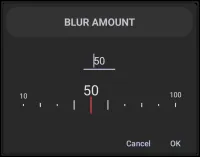
• Blur amount - (Visible when Blur behind is ON). The slider controls the intensity of the background blur by selecting Blur amount. The dialog, when tapped, is displayed here uses the slider with a range from 0 to 100, with 100 representing an opaque (blocked) view.
• Dim behind - When toggled ON, the background screen will darken (dim) whenever a Window or Folder is opened on top of it.
• Allow interaction behind window - When toggled ON, interacting with objects behind an open Window is possible. When OFF, the background is locked (modal) until the Window is closed. This feature is not available if Blur behind or Dim behind are activated.
• Prevent window reordering - This option becomes available when Touchable behind is ON. When activated, tapping a Window will not bring it to the front. This is useful for keeping “widget-like” windows permanently behind other floating windows.
• Hide status bar - Hides the Android Status Bar (top bar with clock/battery) while using the Launcher.
• Hide navigation bar - Hides the Android Navigation Bar (bottom buttons or gesture pill) for a full-screen immersive experience.
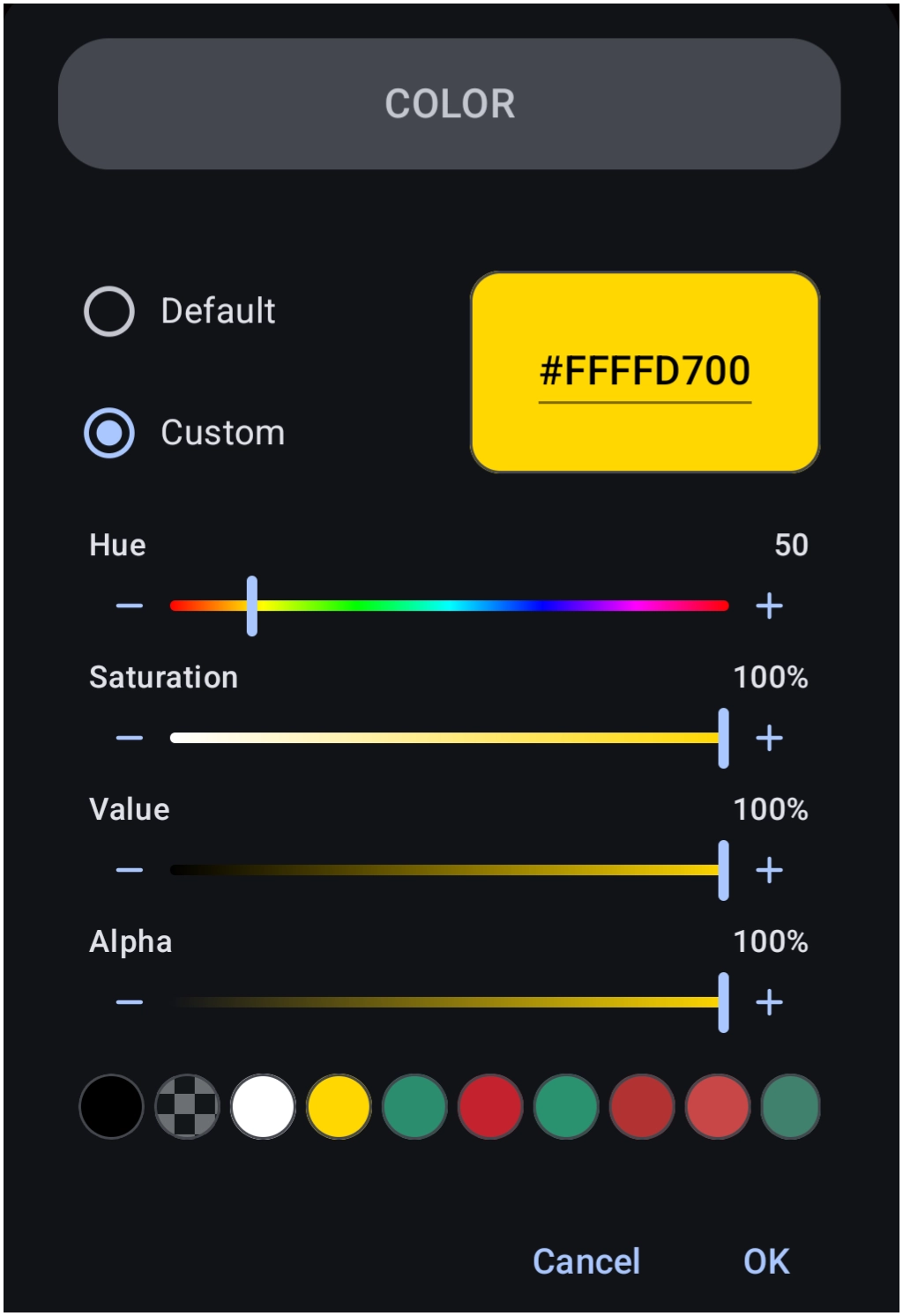
• Status bar background - Defines a custom background color for the system Status Bar (if not hidden). Click here ' to open an image of the dialog … or … the Launcher's Color Picker utility as described in the UI section of this manual.
• Navigation bar background - Defines a custom background color for the system Navigation Bar (if not hidden). Click here ' to open an image of the dialog .. or … the Launcher's Color Picker utility as described in the UI section of this manual.
• Dark icon on status bar - Forces the Status Bar icons (time, battery, etc.) to be dark (black). Use this if the layout's Status Bar background color is light.
• Overlapped system UI - When toggled ON, the Launcher content draws behind the Status and Navigation bars, effectively making the bars transparent overlays on top of the layout.
• UI theme - Selects the visual theme (Light, Dark, or System Default) for Total Launcher's own menus and dialog boxes. Click here to view the dialog.

• Dynamic color scheme - (Android 12+) When toggled ON, Total Launcher generates a color palette based on the device's current wallpaper (Material You). These colors are automatically applied to Total Launcher's own menus and dialogs. Additionally, this enables the “Dynamic color” tab in the object color picker, allowing a user to select and force specific system-generated shades onto individual Launcher objects (shapes, labels, etc.) or a specific user-selected custom color.
• Ripple color - Sets the color of the “splash” animation that appears when tapping icons or buttons.
• Select icon - Customizes the visual style of the selection (currently checkmark) icon used throughout the Launcher's widgets. Click here to view the dialog where a user can choose Color, Dynamic color, Icon pack, Shape, or Image.


Comments & Feedback
Toby Lancer is ready to help! Look for the Quick Help form:
► Desktop: left sidebar located near the bottom for Private to Admin
► Mobile: 3-bar menu at page top.
► Use the Discussion section below to share any experiences and communications with other Total Launcher users.
► Any Registered User can directly update this and any wiki page if desired.
Moderation: To keep the manual clean, all comments are held for appropriateness review. Preview any comment before submitting it. It will not be displayed after submission until it is reviewed. So, please, do not resubmit.
Formatting: If using any code snippets, place them inside code tags (e.g., 'code') using double single quotes (') before and after to keep them readable.
Be Kind: This is a community effort. Please keep feedback constructive and on topic.
~~DISCUSSION~~